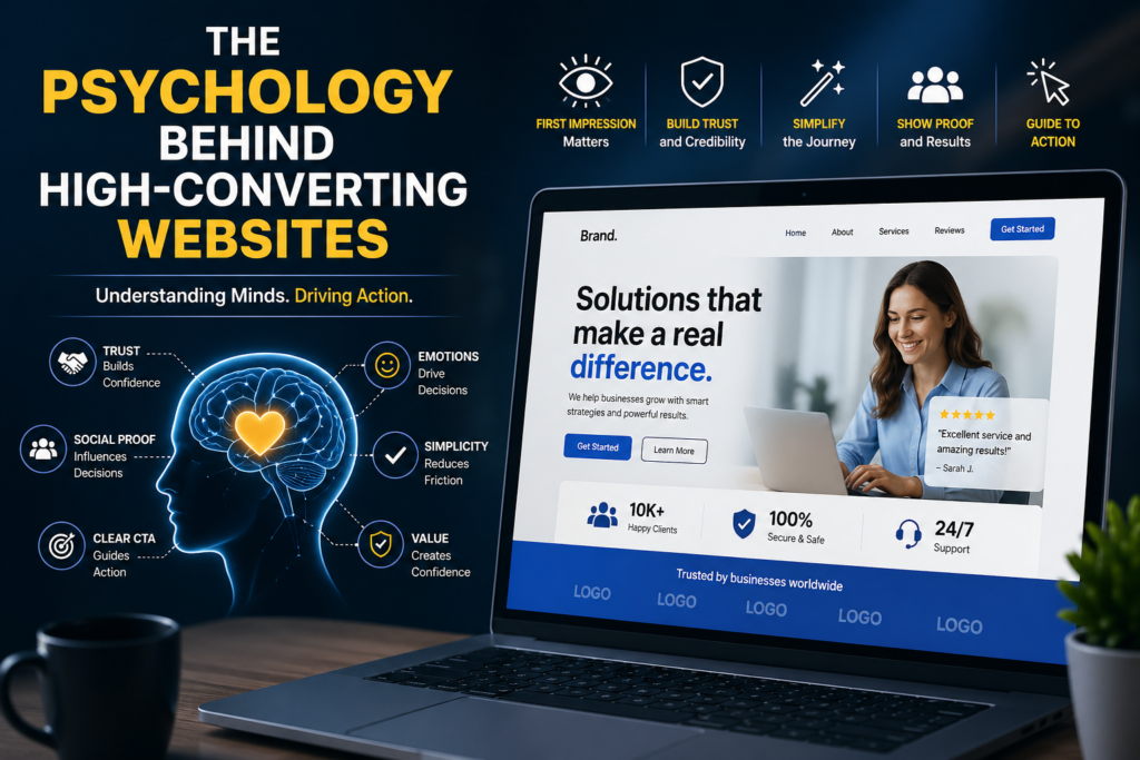
The psychology behind high-converting websites plays a major role in turning visitors into customers. A well-designed website uses trust, simplicity, emotional triggers, and clear calls-to-action to guide users toward taking action.
A website that converts well doesn’t just look attractive, it guides visitors in a way that feels natural, trustworthy, and easy. When businesses understand how people think, feel, and make decisions online, they can design experiences that turn visitors into customers.
First Impressions Matter
People form opinions about a website within seconds. If a site looks outdated, cluttered, or confusing, many visitors leave before reading a single word. Clean layouts, modern visuals, readable fonts, and organized sections create an immediate sense of professionalism.
This first impression builds confidence. Users often associate a polished website with a reliable business.
Trust Signals in High-Converting Websites
Online visitors are cautious. They can’t physically see the business, talk to staff face-to-face, or test products in person. That means trust becomes one of the most important conversion factors.
High-converting websites build trust through:
- Customer reviews and testimonials
- Secure payment badges
- Clear contact information
- Professional branding
- Transparent pricing and policies
When people feel safe, they are much more likely to take action.
Simplicity and User Behavior in Website Conversions
Too many choices can overwhelm visitors. This is known as decision fatigue. If users see multiple pop-ups, dozens of menu items, and confusing offers, they may choose to do nothing at all.
Successful websites simplify the journey. They guide users toward one clear next step, whether that’s booking a call, signing up, or buying a product.
Simple navigation and focused messaging reduce friction and help visitors move forward with confidence.
Emotional Triggers Used in High Converting Websites
Many buying decisions are emotional first and logical second. People purchase products because they want relief, excitement, confidence, convenience, or status.
A high-converting website understands these emotional triggers. Instead of only listing features, it explains benefits.
For example:
- “24-hour support” becomes “Get help whenever you need it.”
- “Fast delivery” becomes “Receive your order quickly without the wait.”
- “Premium design” becomes “Stand out with a brand people remember.”
Benefits connect emotionally. Features simply inform.
Social Proof Builds Confidence
People naturally look to others when making decisions. If others trust a brand, new visitors feel safer trusting it too.
That’s why testimonials, ratings, case studies, user counts, and client logos are so effective. They reduce uncertainty and reassure potential customers that they are making a smart choice.
Strong Calls-to-Action in High-Converting Websites
Even interested visitors need direction. A clear call-to-action tells users exactly what to do next.
Buttons like:
- Get Started
- Book a Free Consultation
- Download the Guide
- Start Your Trial
perform better than vague options like “Submit” or “Click Here.”
Final Thoughts
High-converting websites succeed because they are built for people, not just screens. They combine design, trust, simplicity, emotion, and clear direction to create a smooth user experience.
When businesses understand the Psychology Behind High-Converting Websites, they stop guessing and start converting. At the end of the day, the best websites don’t pressure visitors they make saying yes feel easy.
Read More About The 10 Top UI/UX Mistakes That Hurt Conversions