You may be attracting visitors to your website but if you are not seeing the conversions, it could be down to your UI/UX. There are some subtle errors that can drive your customers away. Here are some of the more common mistakes, explained simply.
Slow Loading Speed (A Major UI/UX Mistakes)
People don’t wait. If it takes longer than a few seconds to load, visitors bail out – and don’t come back.
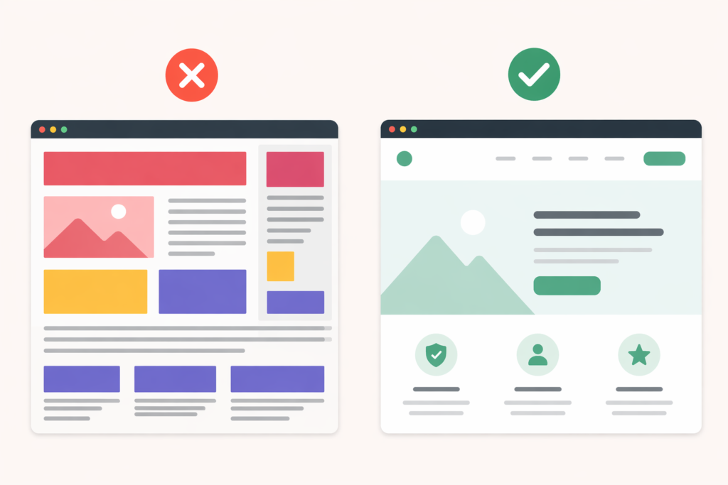
Cluttered Design Hurts User Experience
Overstimulating with too many items, buttons, or banners. When there’s too much going on, nothing stands out.
3. Confusing Navigation
If visitors can’t locate information easily, they’ll leave. Clear menus are the best.
4. Weak Call-to-Actions (CTAs)
Don’t tell people to “click here”. CTAs should be actionable and direct such as “Get Started” or “Try Free”.
5. Not Mobile-Friendly
Users are more likely to view your website via mobile. If it doesn’t render well on mobile devices, you’re missing out on a lot of potential sales.
Poor Readability in UI/UX Design
Small text, low contrast or dense blocks of text are difficult to read. If it doesn’t read well, it won’t be read.
7. Too Many Steps in the Process
Users don’t want to wade through long forms or complicated checkout processes. The longer it takes, the lower the conversion rate.
8. No Trust Badges
No reviews or ratings, or security seals? That’s a turnoff for customers. Users want to be convinced.
9. Inconsistent Design
Variations in styles, fonts or layouts can look amateurish. Consistency is comforting and trusted.
10. Ignoring User Feedback
If they can’t do it and you don’t take note, conversions drop. Listen to your users.
Final Thought
Fixing these UI/UX mistakes is not about adding fancy designs, it’s about clarity, simplicity, and trust. A well-structured website with good UX naturally converts better.
If your website feels easy, fast, and reliable, users will take action without hesitation.
Read More About The LinkedIn Carousel Format That Actually Converts